Revenue, popular items, and repeat customers
Where your money comes from over time, which items earn the most, and who keeps coming back.
Where to find it
Reports → Revenue tab
The Revenue tab in Reports shows where your money is coming from over a time period you choose: which days or months were strongest, which categories earn the most, and whether your income depends too heavily on a few big customers.
Where to find it
Go to Reports, then the Revenue tab.
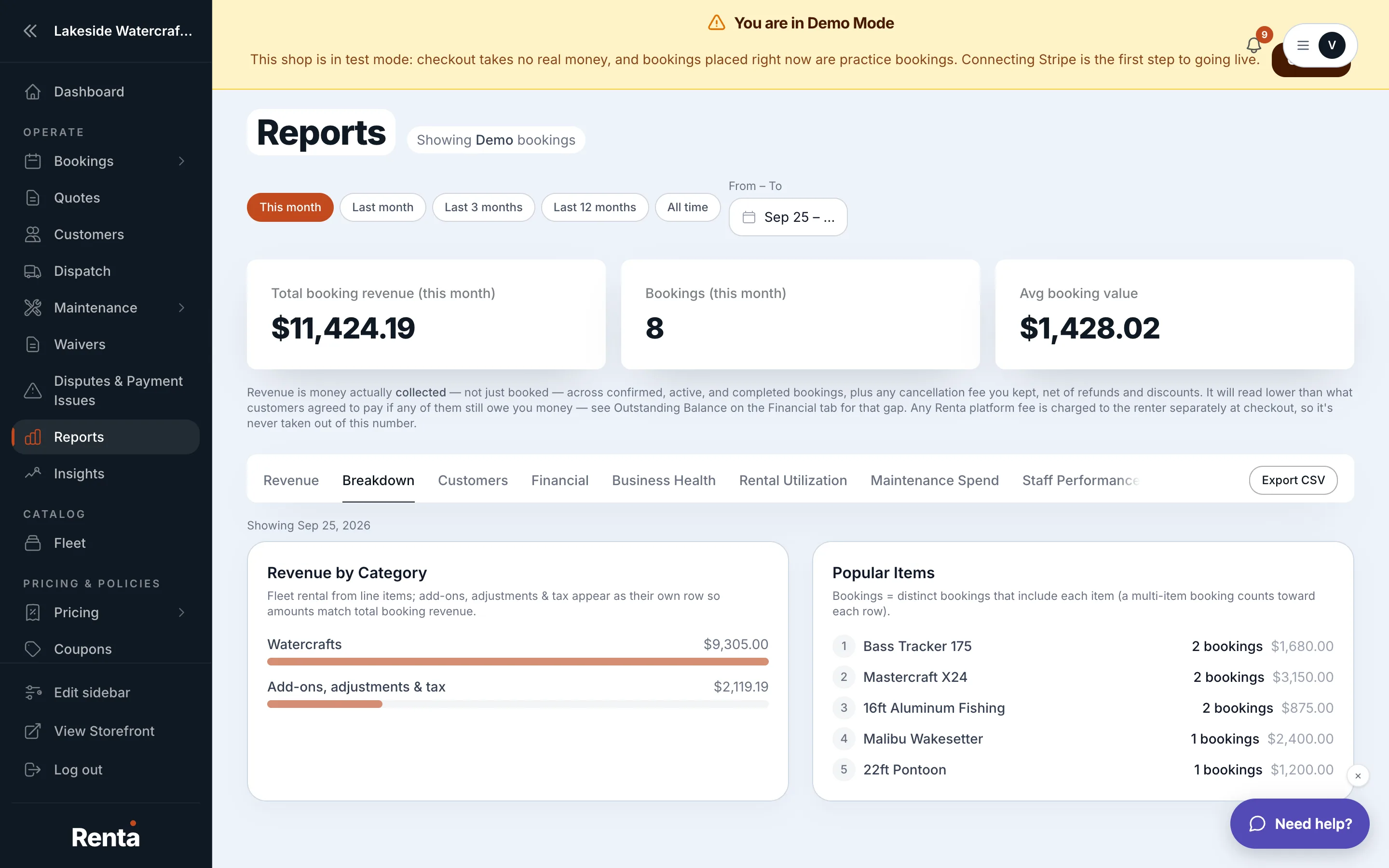 The Revenue tab showing Revenue by Period and Revenue by Category charts
How it works
- Revenue by Period — a line chart of revenue over your selected date range, viewable by day, week, or month
- Revenue by Category — a bar chart splitting revenue by fleet category (e.g. boats vs. bikes)
- Popular Items — a table of your top-performing rental items, with rental count and revenue for each
- Customer Acquisition — a line chart of new customers added over the selected period
- Revenue Concentration — shows whether your revenue is spread across many customers or concentrated in a few, so you can see how exposed you are if one big customer stops booking
For example: if Revenue Concentration shows 40% of your income comes from five repeat customers, losing even one of them would meaningfully affect your monthly revenue — worth knowing before you make decisions based on average numbers alone.
Good to know
- The date range for these charts is set at the top of the whole Reports page — see Choosing the time window for your reports.
- For fleet-specific numbers like utilization and depreciation, see How hard your fleet is working.
Related
Still stuck? Ask the chat.