Making your site look right on phones and tablets (Responsive Overrides)
Set your layout once on desktop, then override just the parts that need to change for tablet or phone screens.
Where to find it
Website → open a page → switch the device toggle in the top bar to Tablet or Mobile
Your desktop layout is the starting point (the "base"). When you switch the canvas to Tablet or Mobile view, any change you make there only affects that screen size — your desktop layout stays exactly as you built it.
Where to find it
Website → open the page you're editing → use the device toggle in the top bar to switch between Desktop, Tablet, and Mobile.
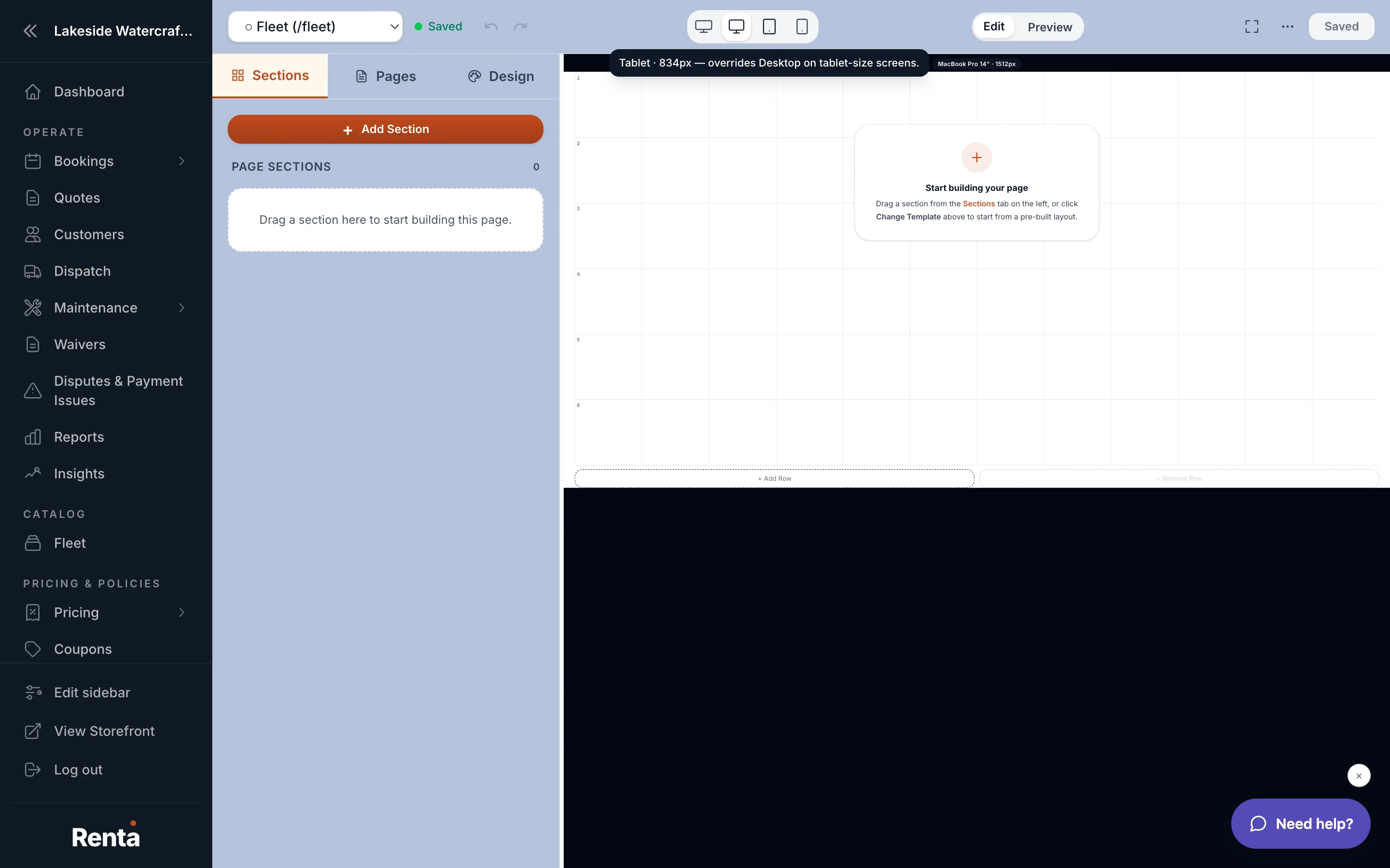 The device toggle in the Site Builder top bar switching between desktop, tablet and mobile
How it works
- Desktop (the base): what you build first. Everything else starts from this.
- Tablet override: edits you make while viewing the Tablet preview apply only on tablet-sized screens.
- Mobile override: edits you make while viewing the Mobile preview apply only on phone-sized screens.
- Screen size ranges: phones are narrower than 640 pixels wide, tablets are 640 pixels and up, and desktop is 1024 pixels and up. (There is also a "wide" tier for very large screens, 1536 pixels and up, which inherits from desktop unless you override it.)
- Tablet and mobile overrides are independent — changing something on mobile does not affect tablet, and vice versa.
- If you don't set a position for a widget on mobile, it automatically stacks full-width so your page doesn't look squeezed.
Example
You build your Hero Banner with a large 40px headline on desktop. On a phone, that headline might wrap awkwardly, so you switch to Mobile view and shrink it to 24px — your desktop version is untouched.
Good to know
- Always build your desktop layout first — it's the base every other screen size starts from.
- If a widget looks wrong only on phones, check the Mobile view specifically; a fix made on Desktop or Tablet won't reach it.
- This works alongside your site-wide theme — see Setting your site-wide colors, fonts and spacing.
Related
Still stuck? Ask the chat.